
The web application development industry continuously evolves to incorporate new trends and technologies like Automaton Testing. It also helps to meet the changing requirements of the customers. In this environment, CSS or Cascading Style Sheets play a crucial role in shaping the visual aesthetics and user experiences of all the websites and web apps.
As we step into 2024, it is needless to say that developers must stay updated with all the latest trends and advancements in CSS. This approach will help them create visually stunning, modern, and user-friendly web experiences. Using this approach, application-developing companies can also massively boost their audience reach and help create a positive image.
In this article, we will explore some of the best CSS trends to watch out for in 2024. We will also understand some of the best practices that can help developers improve the visual aesthetics of web applications while using CSS.
Understanding CSS
Everyone involved in the web development industry must have a basic understanding of CSS fundamentals. This is because cascading style sheets dictate the presentation and styling of HTML elements within a web page. CSS is especially useful when developers define the visual appearance of elements on the screen, including their font, color, spacing, layout, and even animation.
To further improve our knowledge about CSS fundamentals, let us take a quick look at some of its major components:
- Selectors
Selectors are the patterns that the developers use to select and style the HTML elements present on their web pages. These patterns can also target elements based on their class ID, type, attributes, or relationship with other elements. The following code snippet shows the implementation of selectors in CSS:
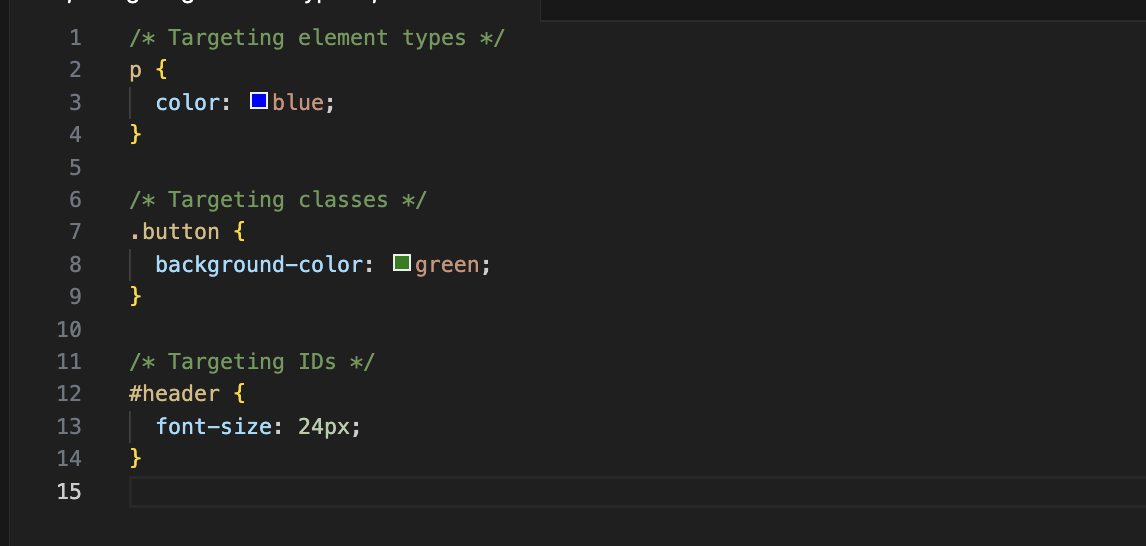
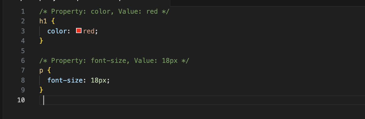
- Properties and Values
Using the CSS properties and values, the developers can define the appearance of an element. Values are responsible for specifying the settings of the defined properties. The following code snippet shows the implementation of properties and values in CSS:
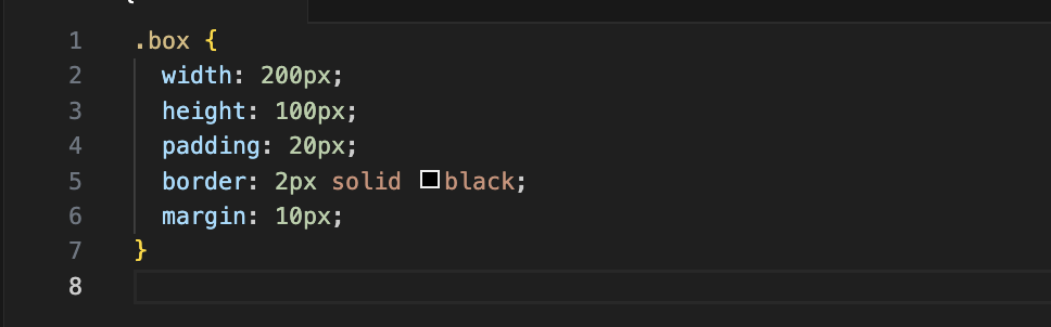
- Box Model
Using the box model, the developers can describe how elements are rendered in CSS. Some of the most critical parameters in this segment include padding, content border, and margin. The developers must also have a clear understanding of element sizing and spacing in this regard. The following code snippet shows how an element can be defined using the box model:
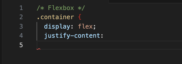
- Layout
Finally, using layout technologies with CSS, the developers can arrange all the elements present on a web page. The most commonly used layout patterns include floats, flex boxes, positioning, and CSS. We would also like to mention that the positioning layout attribute can be further classified into absolute, relative, and fixed positioning.
Revolutionary CSS Trends for 2024
Based on the changing requirements of the modern application development industry and the customers, we have created a list of the most revolutionary CSS trends that developers must watch out for:
1.Support for Dark Mode
In recent years, dark mode has gained a lot of popularity in the application development industry. Some of its significant benefits include improved battery life on mobile devices, reduced eye strain, and aesthetic appeal. While using CSS custom properties or variables, the developers can quickly implement dark mode support in web apps.
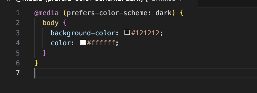
Moreover, using the ‘prefers-color-scheme’ media query, the developers can dynamically adjust the color scheme depending on the user system preferences. This approach also offers a seamless transition between light and dark modes. Using the following code snippet, the developers can implement dark mode support while using CSS.
2.Animations and 3D Effects
CSS continues to push the boundaries of web design using 3D transforms and animations. These elements also allow the developers to create immersive and interactive experiences for their end users. Moreover, due to the significant advancements in hardware acceleration and browser support, developers can use 3D transformations to add perspective depth and realism to their web elements.
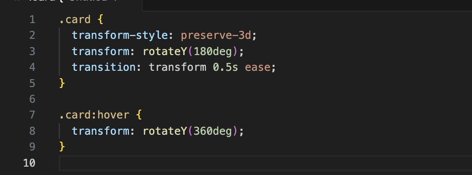
Some of the major implementations of 3D effects and animations include rotating cards and parallax scrolling effects. With the creativity of modern developers, there are endless possibilities for creating visually captivating websites that engage users and provide value to user interactions. The following code snippet allows the implementation of animations and 3D effects with CSS:
3.Variable Fonts
Using variable fonts, the developers can implement a significant leap forward in terms of typography on the web page. This is because variable fonts allow the developers to inculcate unprecedented control over typefaces with a single font style.
Moreover, by defining custom access such as width, weight, and slant, the developers can achieve precise typographic adjustments without the implementation of multiple CSS rules or font files.
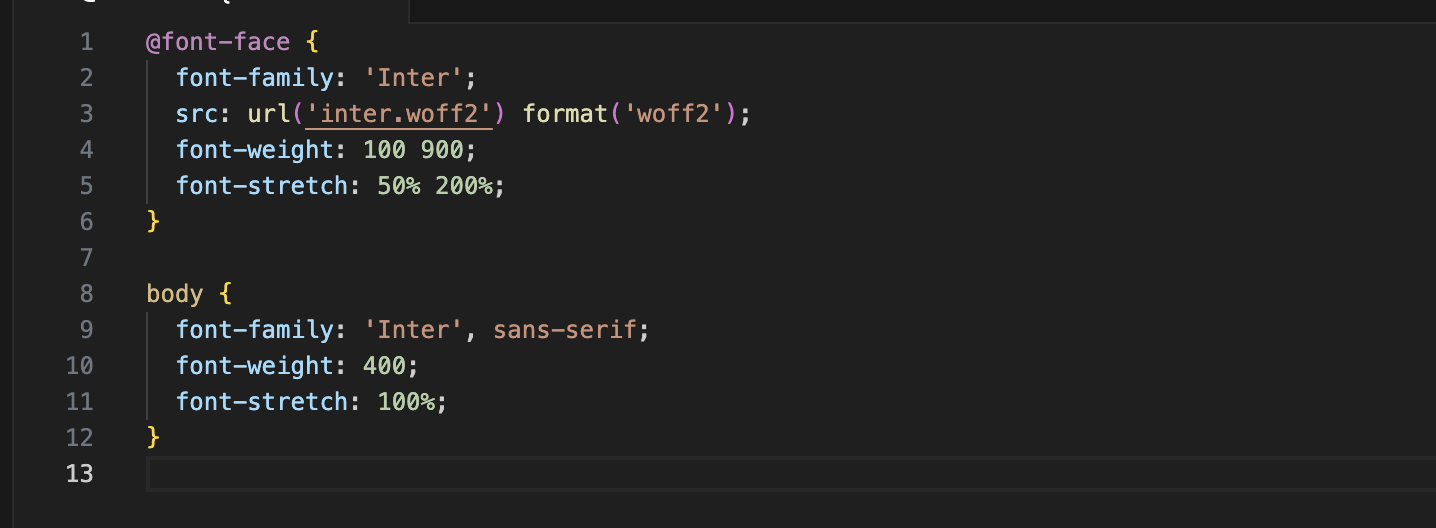
Moreover, by using variable fonts, the developers can not only reduce file size to enhance performance but also have greater control over the creativity and flexibility of the web design. The following code snippet helps in the implementation of variable fonts with CSS:
4.Soft UI (Neumorphism)
Soft UI, also referred to as Neumorphism, is a new design trend that mimics physical realism. It achieves this goal by combining subtle shadows and highlights to create a three-dimensional and tactile appearance for the elements on the web application.
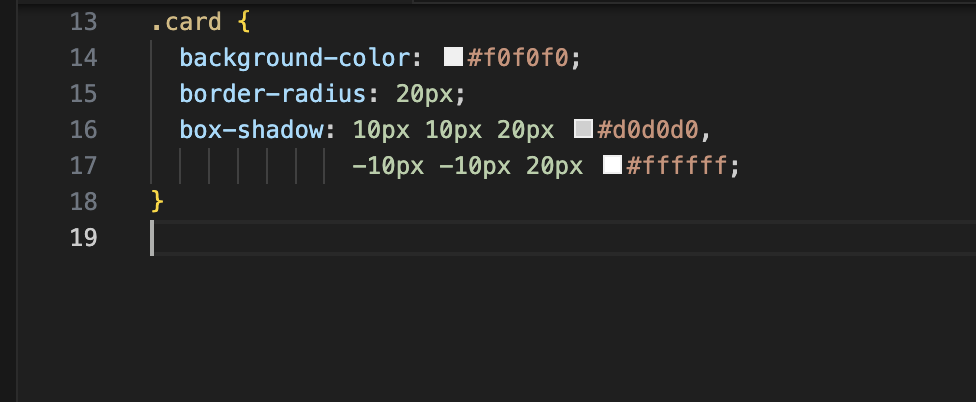
Although skeuomorphic design fell out of favor in the past application development industry, Neumorphism offers a modern take on realism using a minimalist aesthetic approach. This designing process can carefully balance light and shadow using CSS box-shadow and border-radius properties. The final goal for the developers is to create a soft and inviting visual style that enhances intuitiveness and usability.
The developers can create a soft user interface for their web applications using the following code snippet.
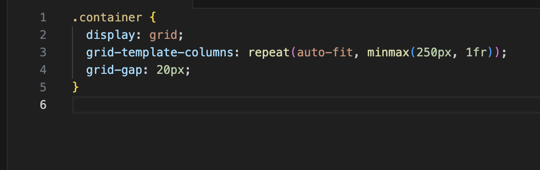
5.CSS Grid Layouts
Modern CSS grid layouts continue to revolutionize the approach to web layout design even in 2024. This is because this approach offers unparalleled control and flexibility in the alignment and positioning of the web application content. It also has intuitive syntax and powerful capabilities to enable the developers to create responsive and complex layouts easily.
So, whether the developers are designing multi-column magazine layouts or dynamic card grids, CSS grids will empower them to achieve pixel-perfect designs without relying on cumbersome 3rd party libraries or frameworks. Using the following code snippet, developers can utilize CSS grid layouts to design the user interface of their web applications.
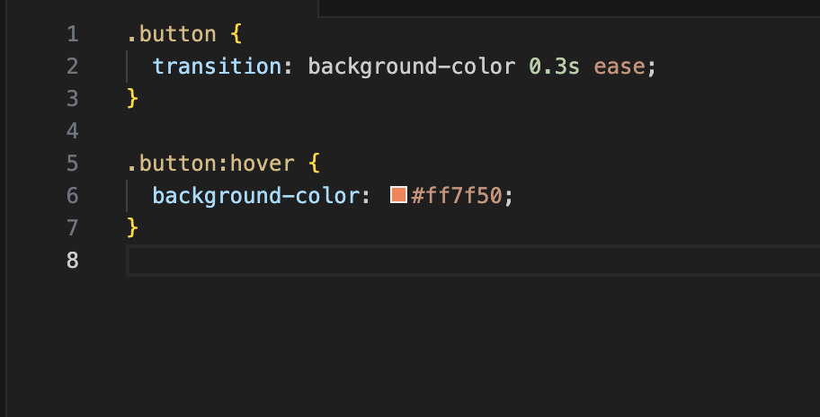
6.Microinteractions
We can define microinteractions as specific visual cues or animations that provide feedback and enhance user engagement on the websites. These can range from button hover effects to loading spinners. Microinteractions also add personality and delight to the user experiences on web apps.
Using CSS animations and transitions, the developers can quickly implement microinteractions without the need for the JavaScript programming language. Therefore, this approach helps in smoother performance and improved accessibility across various phases of the application development and testing cycle.
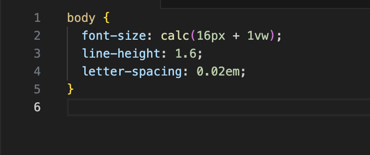
7.Responsive Typography
It is crucial to implement responsive typography to ensure accessibility and readability across a wide range of devices, operating systems, and screen sizes. CSS has various dedicated viewport units, including ‘vh,’ ‘vmin,’ and ‘vmax’ along with the ‘calc()’ function for enabling the developers to create responsive and fluid typography.
Using this approach, the developers can also seamlessly scale the application’s typography across multiple viewport dimensions. So, by setting line-heights, font sizes, and spacing related to the viewport size, the developers can maintain optimal readability and legibility on every device.
Using the following code snippet, the application developers can integrate responsive typography within their app infrastructure:
Best Practices for Using CSS
To further elevate the application designing phase with CSS, we recommend the developers integrate the following best practices within their development environment:
- Using External Stylesheets
The developers must separate their CSS into external style sheets instead of using embedding styles directly within the HTML. This approach promotes code reusability and also makes it easier to update and maintain the style across multiple pages. By entering the following code in the terminal window of CSS, the developers can complete this process:
<link rel=”stylesheet” href=”styles.css”>
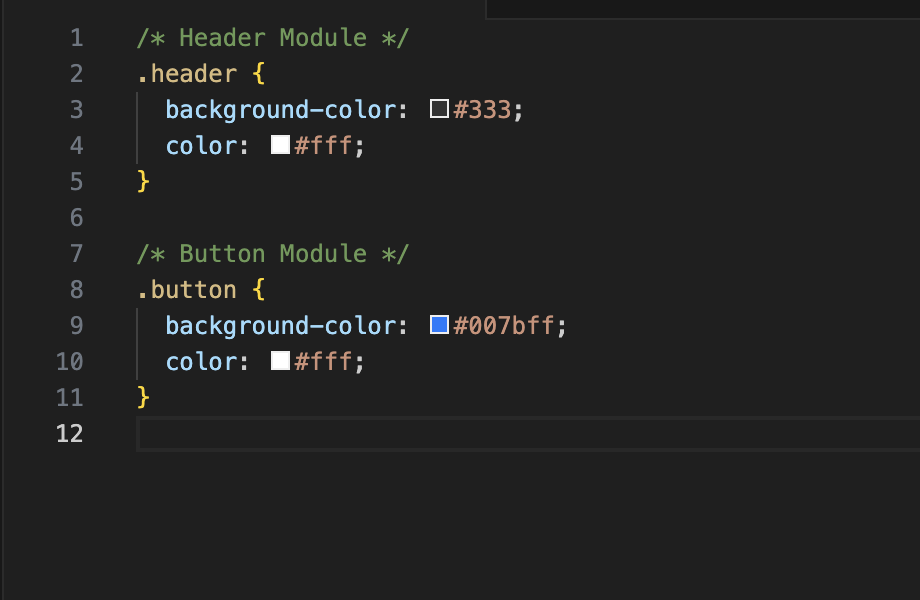
- Implementing a Modular Approach
It is also essential to organize the CSS code into modular components. Each of these components must be responsible for styling a specific part of the web page. By implementing this approach, the developers can enhance the code readability, facilitate teamwork and also reduce the complexity in the overall development and testing environment.
The following code snippet will allow the developers to segment all the components of the user interface into individual entities.
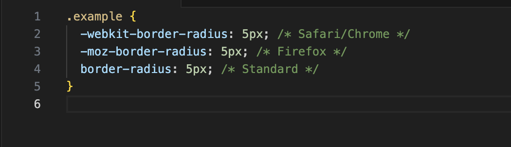
- Testing the Cross-Browser Compatibility
The developers must test the CSS infrastructure across multiple devices and browsers. This approach will ensure consistent rendering and compatibility. The developers can also integrate vendor polyphenols and prefixes for CSS features that may not be fully supported in all browsers. The following code snippet will allow the developers to implement cross-browser compatibility testing on CSS:
Moreover, the developers can also integrate AI-powered test orchestration and execution platforms like LambdaTest to execute automated cross-browser testing on their web applications across multiple real devices, browsers, and operating systems. LambdaTest can also run the test instances on thousands of different devices and browsers simultaneously using parallel testing and machine learning.
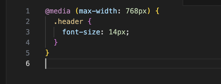
- Practicing Responsive Design
The developers must design the CSS architecture using responsiveness as a benchmark. This approach will help ensure style adaptability to different screen sizes and devices. The developers must also utilize fluid layout techniques and media queries to create responsive designs that provide an optimal viewing experience on multiple devices.
Maintaining a responsive design is also crucial, as more than 53% of the total Internet traffic comes from mobile devices, including smartphones, tablets, and even smartwatches.
We have mentioned an example code for implementing responsive design on web applications while using CSS:
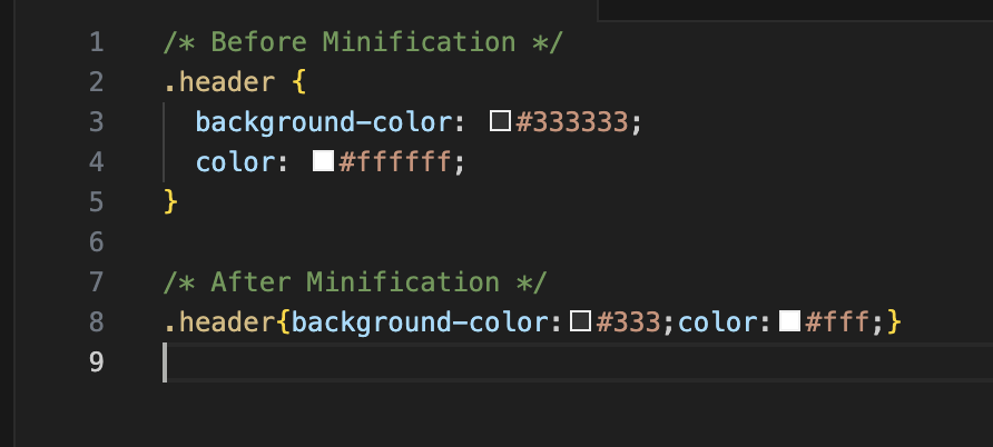
- Optimizing the Performance of the Web Apps
The developers must optimize their CSS performance by minimizing unnecessary styles and reducing the file size. The developers can also integrate other 3rd party tools like CSS minifiers and preprocessors like Less and Sass. This approach will help them to not only compress the overall source code but also organize it efficiently.
The Conclusion
So, with 2024 in mind, we can easily say that CSS will continue to evolve and innovate. This rapid change will allow the developers to create visually stunning, immersive, and user-friendly web apps. Moreover, the developers can stay ahead of their competition by embracing unique trends such as dark mode support, 3D effects variable fonts, CSS grid layouts, Neumorphism, micro-interactions, and responsive typography.
All these practices are crucial for delivering high-quality digital experiences to users all around the globe. It is also helpful for multiple scenarios, including building personal portfolios, ecommerce websites, or enterprise applications.